rpa advertising
redesigning a company intranet

RPA is an advertising agency with over 500 employees. The agency’s intranet, otherwise known as RPA Cafe, is the central holding place for resources associates might need in their typical workdays – such as internal documents/templates, time tracking, resource request forms, etc. The Cafe was built in FileMaker over a decade ago and lacked oversight in its content organization as the years passed. We were tasked with building a new intranet using Microsoft SharePoint that would be modular in design to account for future content, feel more intuitive to users in their way-finding, and scale across multiple breakpoints, while showcasing agency work.
Challenge
Content Audit, Information Architecture, Wireframes, Usability Testing
Responsibilities
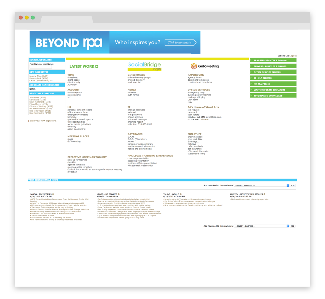
Aside from not being responsive, the entire experience lived on one page, dispersed across multiple columns with no hierarchy. It was unclear which UI elements were interactive and which were static. My goal was to prioritize content frequented by all associates and to de-prioritize less accessed resources.
old site
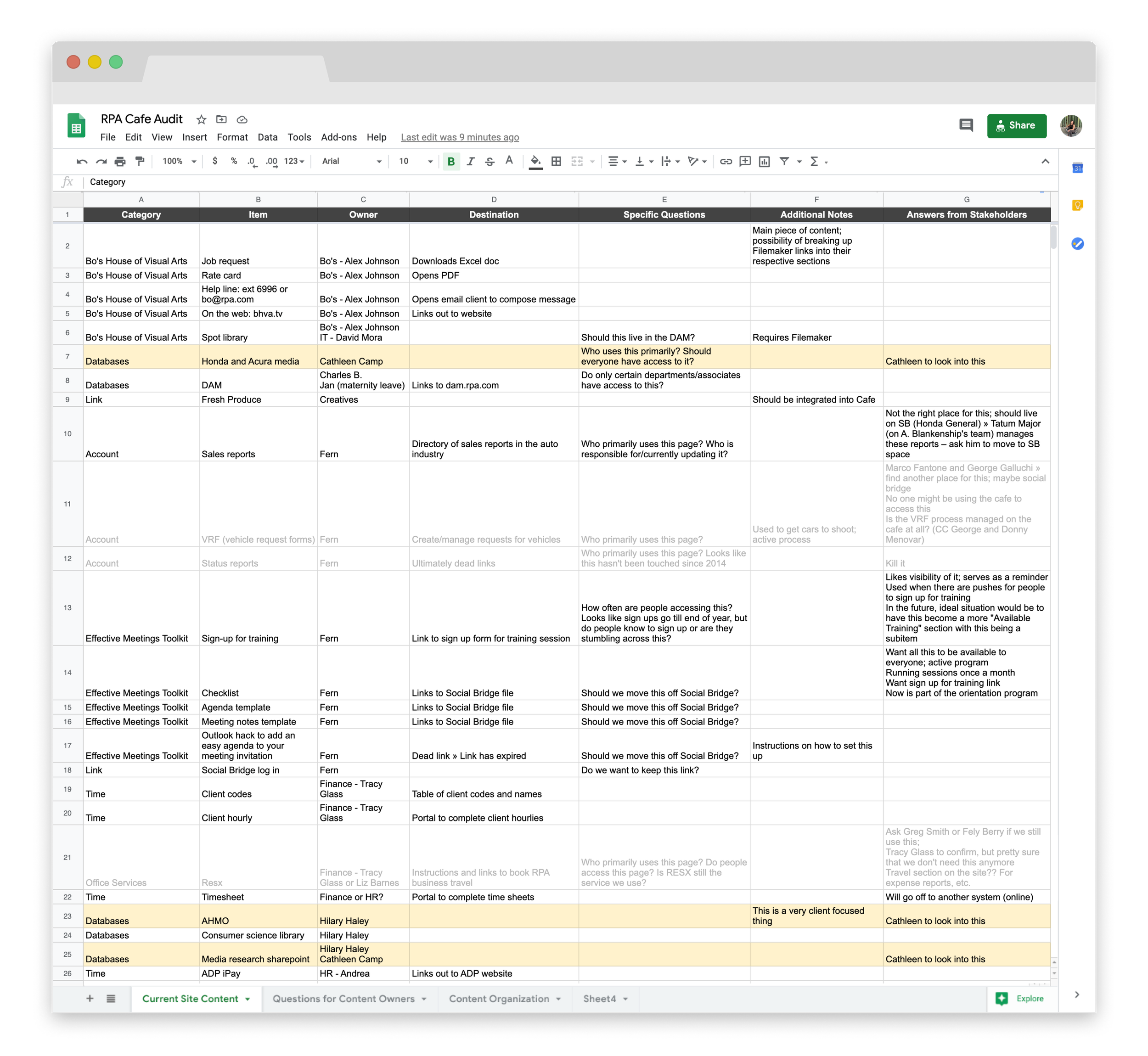
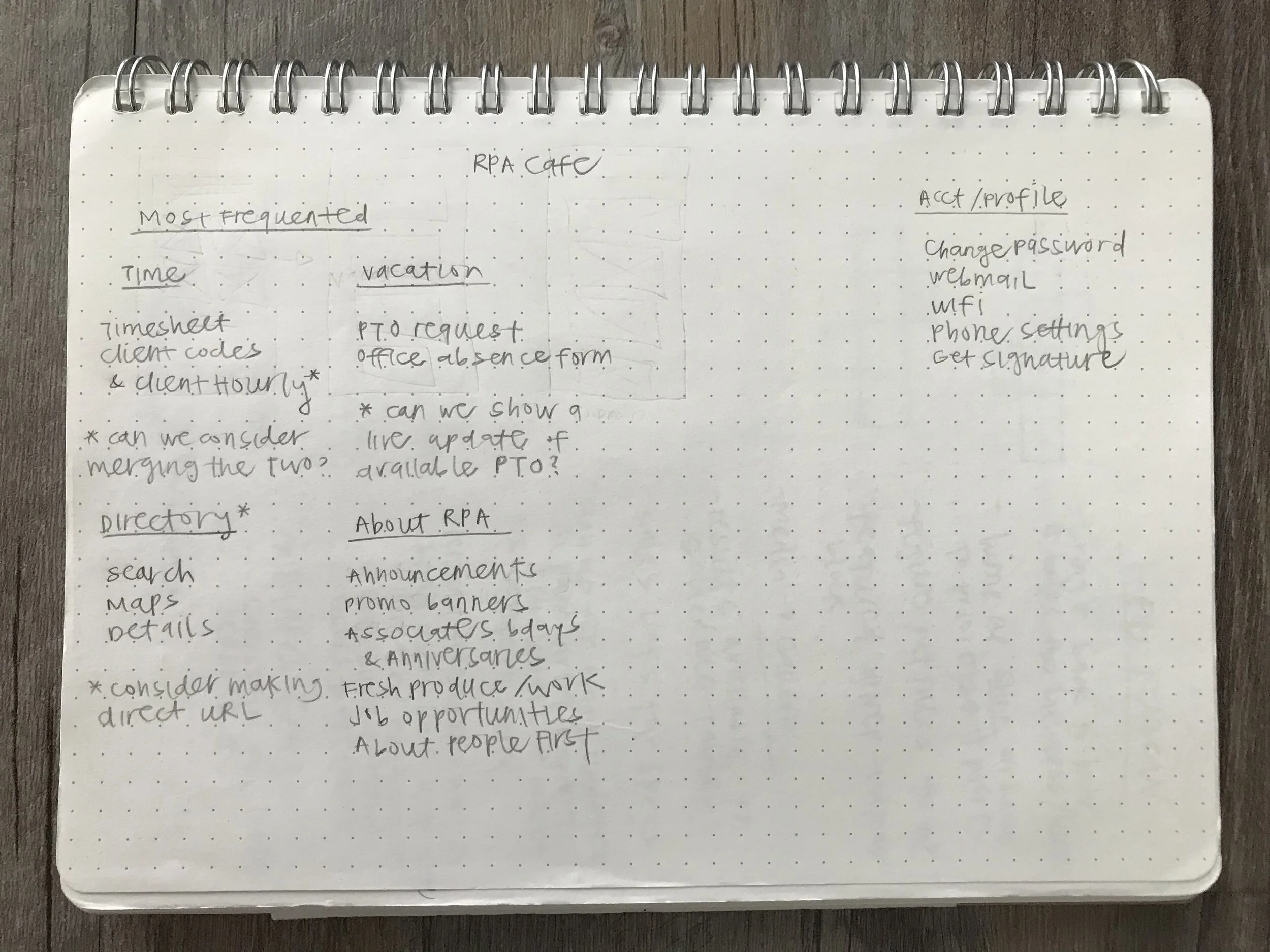
To start, it was necessary to understand the breadth of the existing content. I conducted an extensive audit that documented each link’s destination and identified the content owners who could provide additional context. We conducted several stakeholder interviews to understand content relevancy, frequency of updates, existing shortcomings, and areas for improvement. These initial steps helped inform what pieces would move on to the next iteration and how to phase out our build.
learning the Content

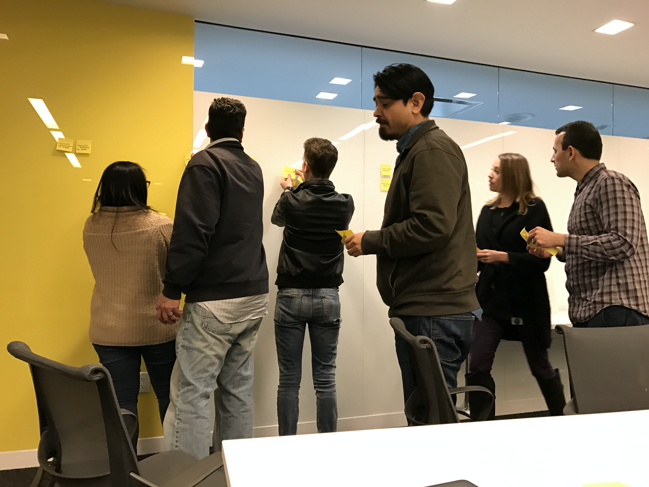
As a way to see how other users inherently categorize the site content, we recruited a handful of associates to participate in a card sorting exercise. This data ultimately informed the new Intranet’s information architecture. Furthermore, I did this exercise independently beforehand to see how the group’s buckets aligned with mine (thankfully, we were on the same page).
Taxonomy + Information Architecture

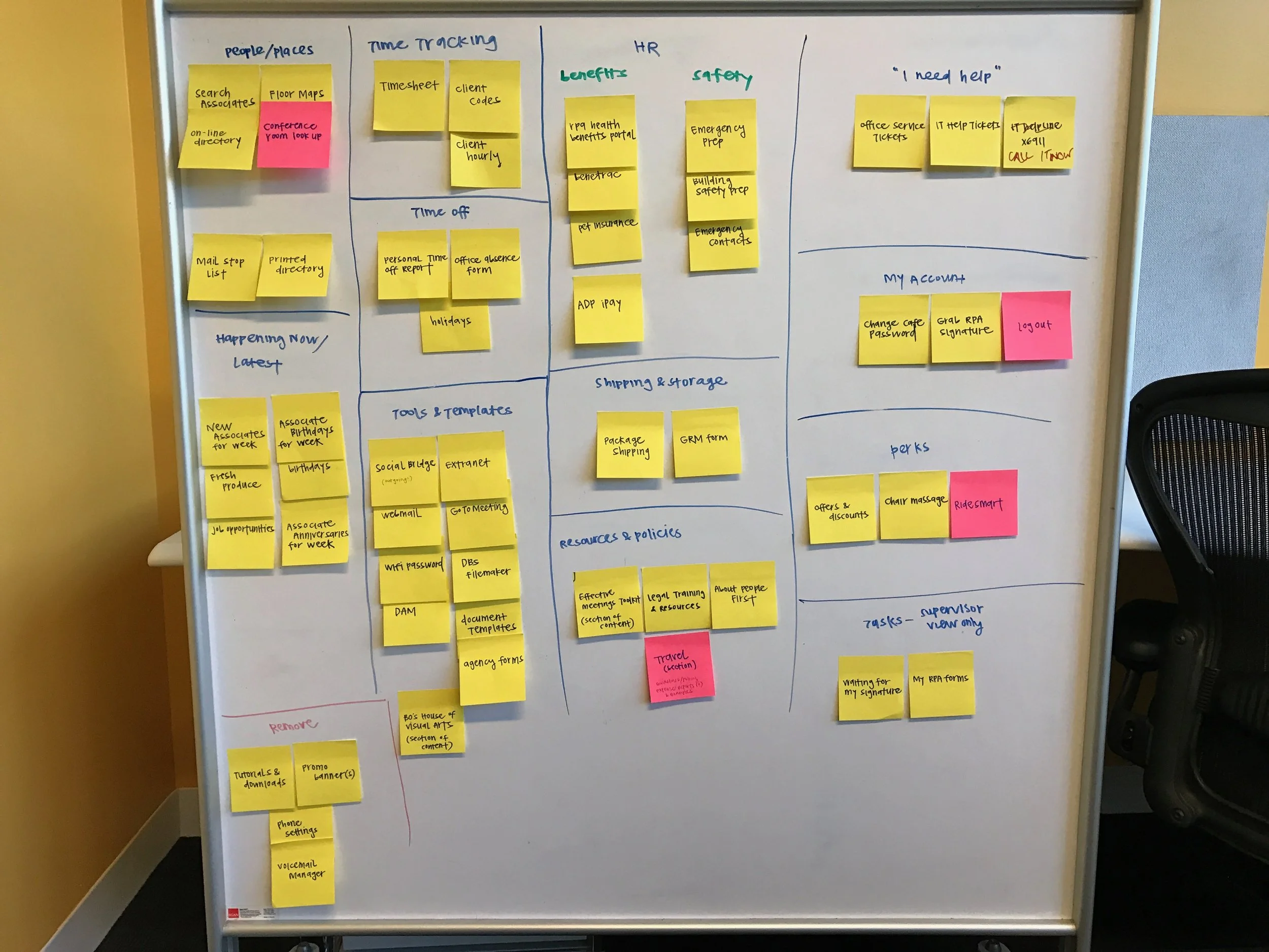
The findings from the earlier exercises drove my design decisions as they revealed what categories users would find intuitive. These insights increased my certainty about how to hierarchically organize the content. The structure would promote resources associates across the company use (such as time tracking tools, directories, requesting time off, etc.) and de-prioritize features that only a handful of users accessed (e.g. mail stops, package shipping, storage).

After the content gathering and interviews were conducted, we were ready to begin the creative design phase. To start, I created guiding principles that aided the team in staying focused and consistent throughout our design process.
Guiding Principles
Since associates were accustomed to having all their content accessible behind one click, one of the largest challenges I was faced with in my designs was keeping the content as few clicks away as possible.
Wireframe Development
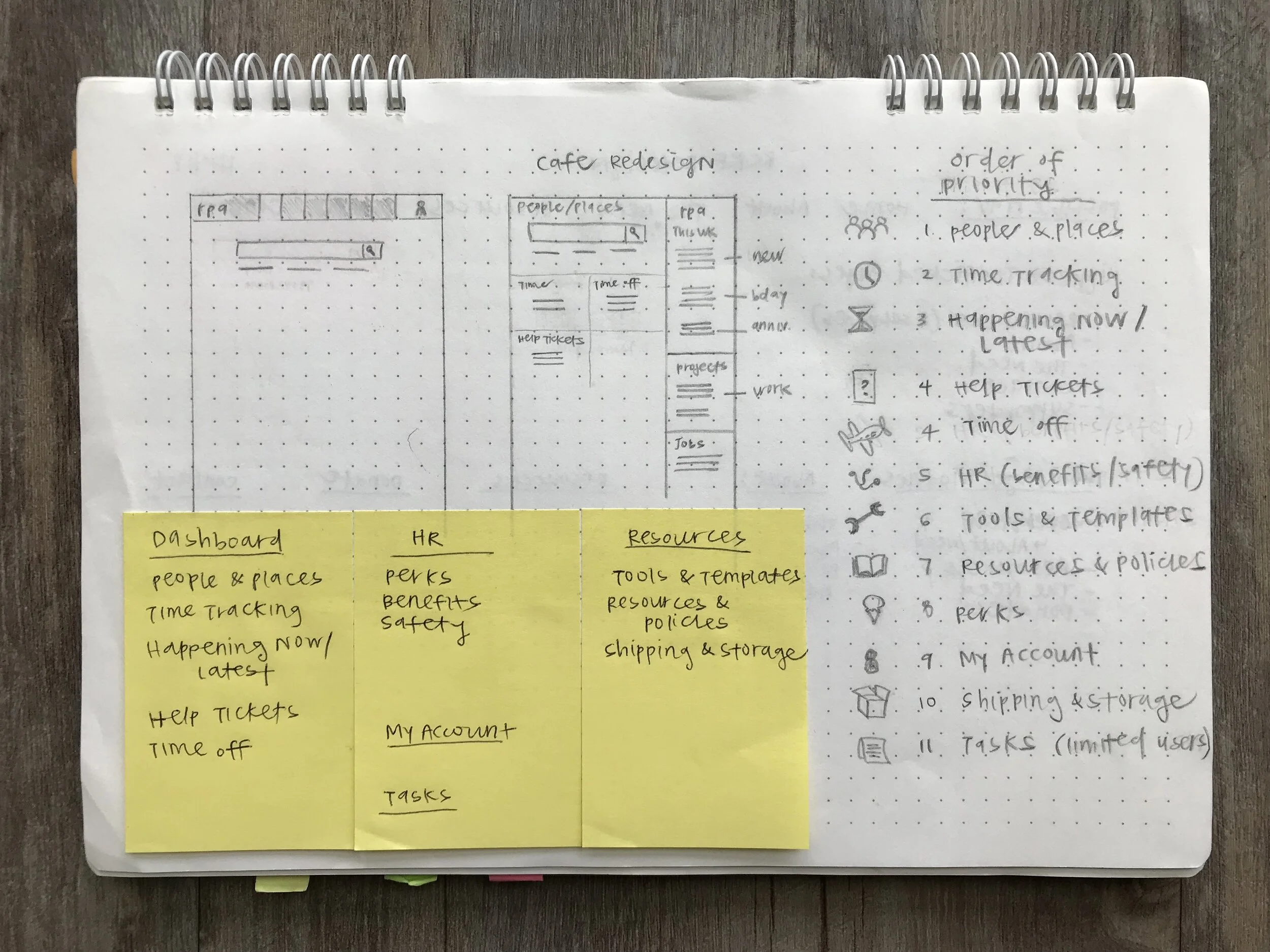

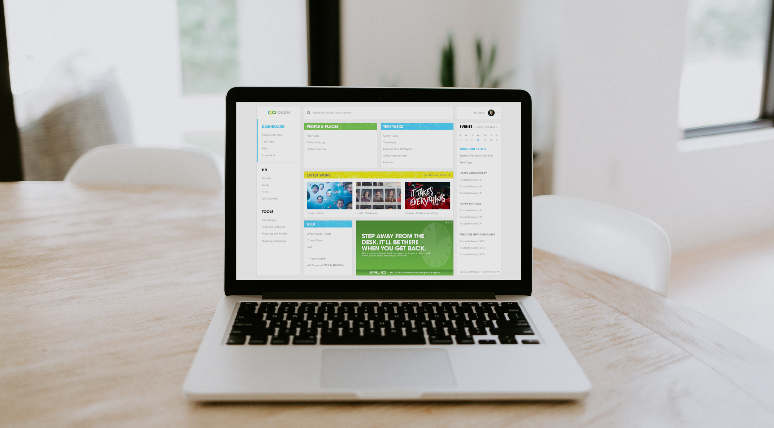
After several explorations, I committed to a solution that organized the content and new features (an agency wide calendar and space for latest work) into three main sections.
The first section contains content every users needs: time tracking, directories and office maps, help hotlines, agency announcements and a showcase of the latest work. The remaining sections are typically accessed on more of an ‘as-needed’ basis – like health benefits, performance review templates, work perks, etc.
Overall, the modular layout allows for the content to be flexible in scaling up or down, while providing a sense of hierarchy.
Navigation
Through surveying associates, we knew that users frequently access the company directory via the intranet. Motivated by our guiding principle stating “design to always be one step ahead,” we made it a goal to make the site-wide search double as a directory search to improve efficiencies. Previously, users would select the directory, load the page, enter their query, and select the desired result to access directory details. With the redesign, users enter associate names into the intranet search, view suggested matches, and gain access to associates’ contact information without loading a new page.
Anticipating Users’ Needs via Search
Prior to starting development, we opted for testing the designs with a sample of associates across the agency. Any new experience was going to come across as a drastic change to our users, so usability testing would help ensure that users could still accomplish the tasks they frequented and gain baseline sentiments towards the new design. To avoid biasing our users, we decided to forego in-person interviews and opted with online surveys. We selected a range of users varying in age and tenure and asked them questions related to first impressions, paths taken to accomplish specified tasks, and overall thoughts on the new designs.
Usability Testing
The results from the survey came back overwhelmingly positive – several users said they could “find stuff quicker” and thought it was “more visual (rather than a list on current cafe).” Another user stated “I like how things are grouped up in the left nav and the most important info lives on General page.” When asked the level of difficulty users felt in their way-finding, all users picked “easy to find.” The user testing validated that our designs achieved the goals we aimed to accomplish and the design was seen as a welcomed change. Since its launch, the team has been able to iterate on the site and add additional resources to the experience.